If you’re lucky enough to live or be vacationing in Warrenton, Oregon this Summer, you’ve noticed the recent explosion of street art installations across the city. It’s a sign of Warrenton’s aspiration to join the ranks of other great street art cities, such as Berlin, Rio de Janeiro, Melbourne, and New York– an honorable goal that comes with a new set of municipal challenges.
Warrenton’s greatest challenges are lack of trained visual artists and quality creative writers, which is evident in these murals:

I had a chance to catch up with Warrenton Police Chief, Matt Workman, on the issue this week. “It’s a sad state of affairs with these murals”, according to Chief Workman. “Our artist community is capitalizing on the rise of graffiti art globally. Some of these guys in other cities are pulling in high 5 figures to create walls in places like San Francisco or Seattle. Shoot, Dave Choe got $200 million in Facebook shares for doing up their office.”
The problem, according to Workman, isn’t the rise of street art in Warrenton. It’s the quality. “City Officials and local business owners have paid good money for these murals. But they’re not good”, added Workman. “These so-called, ‘artists’ are pocketing the money, skipping town, and leaving horrendous work behind.”
“Mark my words, we’re coming after these guys and taking them to small claims court”, says Workman.
I’m not sure if any of Warrenton’s street artists read the Warrenton Warrior but, if you do, let me give you some advice: You really need to practice before creating murals in public. You need to practice a lot.
To that point, let me provide some constructive criticism through compare-and-contrast.
Case 1: The Dugout Mural at Warrenton’s City Park
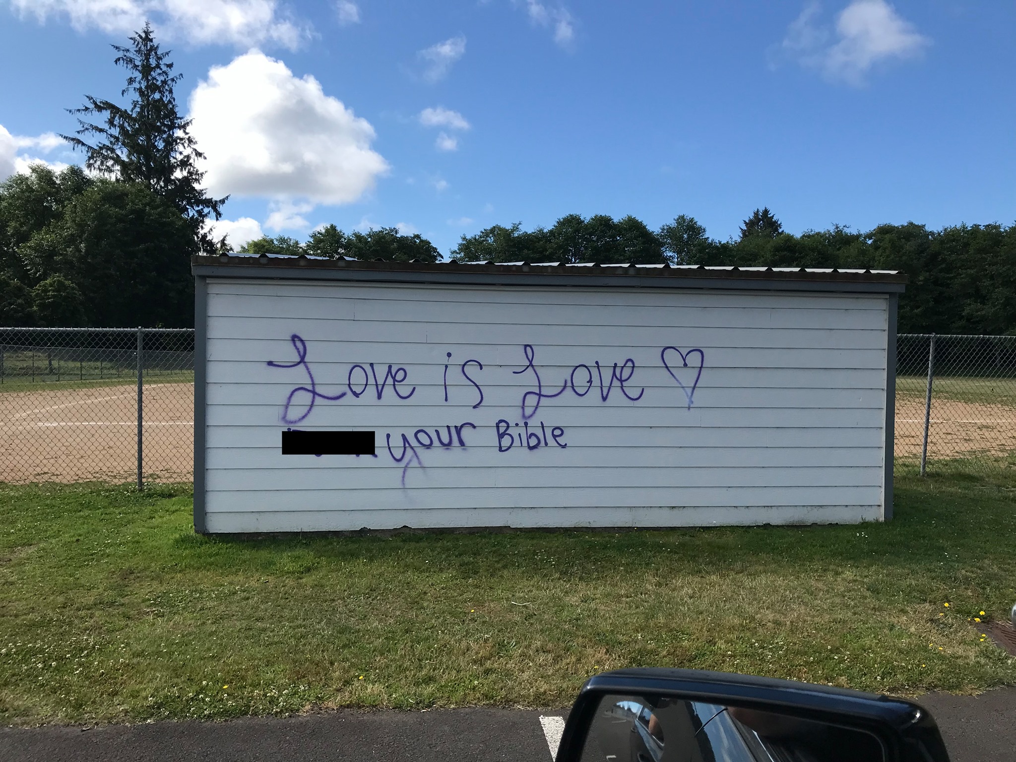
There are a lot of problems with this mural. First, it’s monochromatic. While I appreciate that they used Warrior purple, there’s a lack of depth and visual interest here. The font is also inconsistent. They’re using some sort of cursive font for the Ls… I can’t even tell what font this is. Finally, the message is unrelated to the place. Maybe it’s a commentary on homophobia in professional sports, particularly the MLB. But, this doesn’t seem that thoughtful.
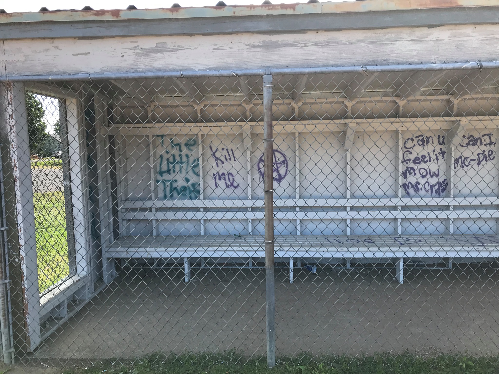
The mural extends interior of the dugout, with some confusing and disjointed messages about pentagrams, suicidal thoughts and Mr. Crab.
Compare that to this:

This Bansky piece is a sly reference to medieval European religious paintings that takes a very simple idea (love > money, you G20 suckers), but does it in an interesting way. Notice that he doesn’t spell it out literally, as the street art above does. Also take note of the contrasting dark tones and how they make the red color pop. Finally, you can see that he put a lot of effort into that stencil. He thought about this one. He didn’t do it in 30 seconds.
Case 2: The Bridge Mural

The artist(s) who created this mural would benefit from a figure drawing course at CCC. It’s also unclear what the scene means. Was this person killed by Astorian anarchists? Are they an Astorian Anarchist killed by Warrentonians? Why does the victim have an opposable thumb attached to their right foot? More questions than answers.
Compare that to this:

This mural is about a specific crime committed by a real estate development magnate in Thailand. Apparently the magnate killed an endangered black panther in a wildlife preserve near one of his developments. Because of his connections with the government’s militaristic regime, he was not prosecuted for the crime.
Notice how the artist represents the human head which, more or less, is easily recognizable as a human head. Same goes for the panther skulls.
Also, the mural contains imagry that relates to the crimincal act and references specific injustices, such as the developer’s blind acts, enabled by Thai military. It’s a little on-the-nose, but it makes sense.
Case 3: Wall of Platitudes
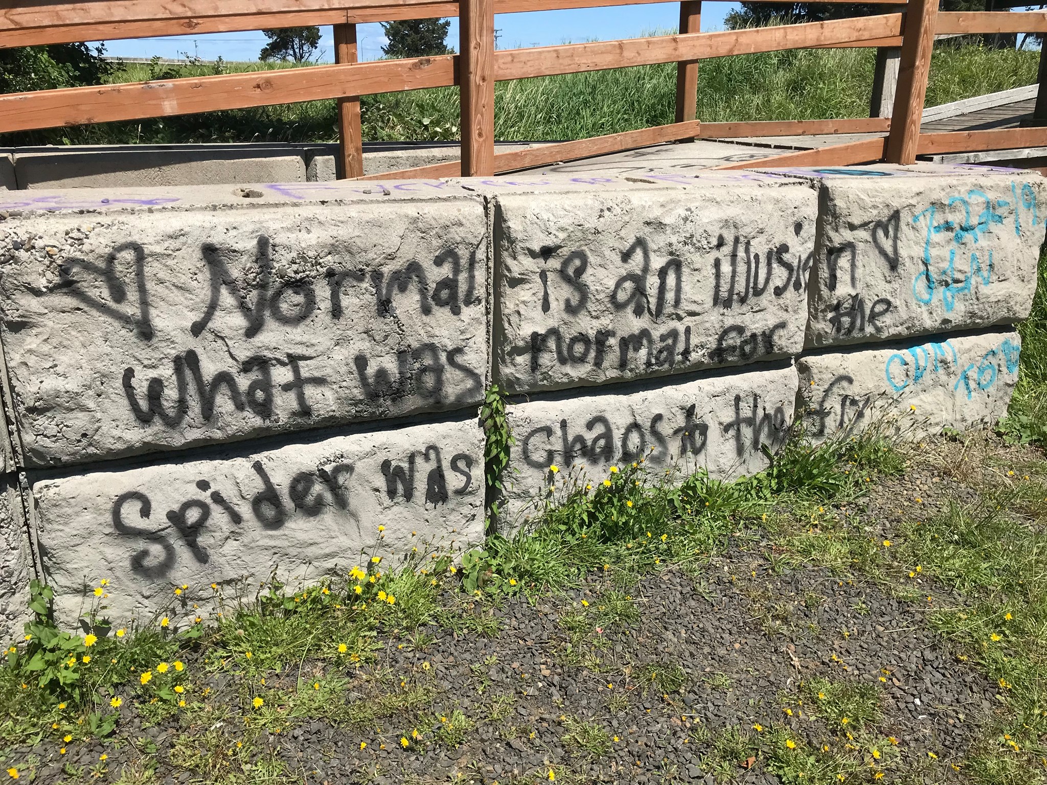
Okay, Warrenton street artist: Scientific studies show that humans develop a “theory of mind” between ages 3 to 5, where they can understand that their own perspective of the world (“their mind”) is not the same as that of others. Your audience already knows this. You’re not getting them to think differently because this mental model already exists in their noggins. For example, I think your statement about normalcy and illusions is trite and simultaneously recognize that you think it is pretty friggin’ deep.
Compare that to this:

It’s just a disembodied spider– nothing too fancy or contrived. If I were to pass it while walking in my neighborhood, I would find it pleasant to look at. I would be pleased to have it around, in contrast to the above mural.
I’d say the same about this mural, made by Portuguese street artist “Odeith”. You don’t need to be too deep to make something about spiders that looks cool:

Case 4: The Steel Conex Storage Box Mural

This is a missed opportunity for the artists to comment on a large, ugly steel box in a public area. The box is aesthetically unpleasant. And it would be interesting to either elevate the box with thoughtful graphic design or to make an interesting commentary on the ridiculousness of the box. But this artist does neither.
Same thing here:

Compare that to this:
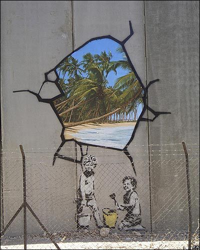
Notice how this artist’s mural makes a direct comment on the ugliness of the wall, while making a subversive statement about the Isreali-Palestinian conflict. The combination of craft and narrative is what makes graffiti art a cultural asset and not another eyesore in Warrenton.
All hope is not lost, though. City officials recognize the issue and are taking steps to address the recent string of bad street art.
In a recent statement to the press, Warrenton City Mayor, Henry Balensifer said that the city will address the issue, increasing funding to visual arts programs in the Warrenton-Hammond School District.
“When we replaced the Grade School Library with gym space, we sort of expected a generation of illiterate youth in Warrenton. But, we had no idea that the visual design skills of this generation would be compromised as well”, according to Balensifer.
Mayor Balensifer added: “These murals are a clear sign that we need to double-down our commitment to the visual arts in our schools. This is an epidemic and we will divert as much money from the Hammond Marina rebuild as needed to get Warrenton’s graffiti back on track.”

Hello all, I’m a local artist have graphic design education to help here. If need grip covering this slop please contact me via email I’m leaving below.
LikeLike
Is this a satire article? There is no need for such a simple situation to be such a huge article. EVERYONE can see that these works are terrible and you dont need to explain why.
Secondly, the heads in charge of this initiative needs to do some research themselves. You can’t always expect some locals claiming to be artists to be professional. Look up the artists with the look you want and reach out to them. Dont half-ass this or you’ll get half-ass work.
Finally, if funds and time and supplies have been depleted, there’s no shame in stencil work. Sometimes it can be gorgeous.
LikeLike